
It’s fair to say that website design has come a long way since the days of Bill Gates seductively leaning on clunky Microsoft computers (thank god).
But as slick website design becomes more and more accessible, competition online becomes tougher and a good-looking website that generates results becomes evermore necessary for businesses serious about growth.
Why website redesign is important
Websites are in many senses your online shopfront: it doesn’t matter how good you are at what you do, if people don’t like what they see when they walk in the door, they’ll leave and buy somewhere else.
More and more businesses realise this, which is why thousands every year put a chunk of their budget into redesigning their site.
And while some succeed, far more fail. Big time.
So what is it that the few do which the many don’t?
What’s their process and how can you follow in their footsteps to ensure your next website redesign strolls the streets of success, rather than rolling down the road to remorse?
How to approach a website redesign
Welcome to 7 Steps to Approaching a Successful Website Redesign, an article which aims to do exactly what it says on the tin. It’ll have you looking at your new website in the same way Bill Gates used to look at computers.

Step 1: Ask yourself “Why?”, “What?” and “HOW?”
British writer and poet Rudyard Kipling once famously said:
“I keep six honest serving-men, who taught me all I know. Their names are What and Why and When and How and Where and Who.”
With website redesign projects being pretty complicated beasts, it’s best to consult at least a few of those honest serving-men before starting.
Coincidentally, the businesses whose website redesign projects fail are the ones that don’t.
Start by clarifying exactly why you’re doing this in the first place what you want off the back of it.
Don’t just think about the aesthetic side of it, either; nobody ever wanted to build an ugly website.
It’s highly unlikely that the site looking outdated is the only thing you’d like to change and improve. Ask yourself:
“Do you generate an abundance of enquiries?”
“Does the site work well on mobile?”
“Are your unique selling points totally clear to all visitors?”
“Do you have visibility over which pages your prospects have viewed?”
“Do you get much quality traffic?”
These sorts of questions will form the basis for your Why.
And once you’ve figured out the Why, beyond being nice on the eye, you’ll need to answer How.
“How can we generate more enquiries?”
“How could it work better on mobile?”
“How can we improve our messaging?”
“How can we get better visibility over our prospects’ interactions with the site?”
“How can we get more, quality traffic?”
Whatever the goals of your site and the results you desire, outline them very early on in the process, write them in huge letters on the wall in your meeting room for all of your key stakeholders to see and refer every decision you make back to them.
And if you know the answers to all the Whats but can’t quite get your head around the Hows, that’s the perfect basis for creating a quality, accurate brief for any agencies you may consider working with.
Step 2: Be lead by SEO
Leading on from our previous point, if your target decision makers can’t find you in search engines, it doesn’t matter how good looking your new site is when it goes live because; will see the thing anyway.
One key step therefore is to think about the keywords you want to rank for in Google before building the site.
The keywords and phrases you want search engines to associate you with need to be woven into the fabric of the site’s structure.
Best practice is to have what’s known as a Pillar Page for each key product and service you sell.
Depending on the make-up of your business, you may also want pillar pages that go into detail on the key industries you serve.
From there, any new content you write around these areas – be they articles, news pieces, blogs, whatever – will link back to the most relevant Pillar Page.

Search Engines love this structure. It makes it really easy for them to read your site and make sense of it all:
“Ah, this company write a lot about Website Redesign, and they’ve got 40 articles on Web Design all of which link back to this page here, which is called /Website-Design-Services, so it must be pretty relevant.”
Key point: Don’t get carried away with cramming your pages full of words you want to rank for; make sure you put usability before keyword density.
It’s easy to be fooled into thinking that cramming your site with as many words as possible will improve your search engine visibility.
But even if this strategy did work, if your site looks and reads like a dictionary – no matter how much traffic you get – your visitors would leave as quickly as they arrived.
Focus instead on giving your prospects key pieces of information, rather than more for the sake of it (more on this in a moment).
Step 3: Design a logical sitemap
The next step then is to put together a logical sitemap that guides your visitors through your site towards submitting their information.
The key here is to think about the process you want them to take on your site, including key pieces of information they need to know at each point.
As a rule of thumb, the higher up each page in your sitemap, the more top level the information should be, with prompts for people to find out more throughout.
Here’s an example sitemap which should illustrate this pretty well:

The idea is for each page to guide your visitors to another, more detailed page, taking them closer and closer to an enquiry than the last.
The deeper the page, the more information you give, with your CTA buttons changing from ‘Learn More’ to ‘Get in Touch’ as you go.
Step 4: Consult your data
Data didn’t really exist in the same form it does now when Rudyard Kipling was about; if it did, I’m sure it would’ve made his list of honest serving-men.
The worst case scenario with this project is that you launch a new site to replace the one that was performing okay and you end up generating worse results than before.
This happens. A lot.
The best way to make sure it doesn’t is to look at all the data you can get your hands on and figure out what’s actually working first.
CrazyEgg is a great heat mapping tool you can install on your site to record your visitors’ activity on screen, helping you to see how people actually interact with your site, allowing you to make informed changes on the layout of your new site as a result.
You may for example see that most people scroll down your homepage, back up to the top and then click something in the menu, which would suggest there’s no value further down your homepage than at the top and a restructure of the content is needed.
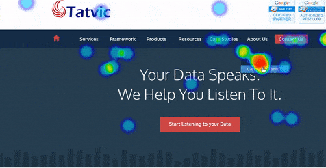 CrazyEgg shows you how visitors interact with your site.
It goes without saying that Google Analytics can help with this assessment, too, telling you which pages have the highest bounce rates (where a user visits and then leaves without going anywhere else on your site), where your traffic is coming in from and much, much more.
Browser Plugins liked SimilarWeb are great for taking a sneaky look at your competitors’ sites and seeing where they get all of their traffic from, too, meaning you can borrow best practices from their most successful pages and know exactly what you’re up against.
All in all, just make sure you’re basing your choices and decisions on statements that start with “Well, we know…”, rather than “I just don’t think…”
Step 5: Wireframe your page layouts
Now you’ve consulted your data and figured out what’s working, it’s time to create some wireframes for the site.
These are essentially the blueprints which will inform your website, focusing more on the user’s experience and flow of the site than the design itself.
There are literally dozens of free tools out there you can use to create wireframes, including WireFrame.cc, Moqups, and NinjaMock.

When designing your layouts, be sure to keep everything as simple and clean as possible, constantly bearing in mind what you want your visitors to do next and what information you think is most logical to give them at each given point.
As a rule of thumb, the most important information should be at the top, with more specific details saved for further down each page.
Step 6: Be clever with your CTAs
Call to Actions (or CTAs for short) are the prompts you sprinkle throughout your website to nudge your visitors towards submitting their details, turning them into those all important leads.
Without well-placed, quality CTAs, your website will be like a bit of a leaky bucket, with most of your traffic flowing straight back out again, never to return.
If you’re ever going to see a significant return on your website investment then, you need to be tactful with your CTAs.
Of course, you don’t want to put them everywhere, with pop-up banners, buttons and flashing arrows forcing your users towards your forms; nobody was ever annoyed into submitting their details on a website.
Instead, put them throughout your site at the most logical points possible, thinking about the step your visitors are most likely to take at each point.
Sometimes, a purchase enquiry can be too much for someone at their stage in the buying process, so consider other methods of lead capture, too.

Creating free guides and reports can be a great way to help your prospects out with the free information they’re looking for, while capturing them as a lead in the process.
Failing that, the good old fashioned mailing list signup can be a great way to capture the data of your prospects, too.
Whatever you do, make sure your CTAs are obvious on the page.
If the majority of your pages are blue and white, don’t use a blue and white buttons.
Go for a red, green, pink, orange – anything that will stand out and catch the attention of anyone who views the page.
Step 7: Keep it Minimalist
So finally, we get to the design bit.
When you do design your site – or at least guide your designer on what you want – make sure you go in with the mantra Less is More.
Don’t cram each page and section with more content just because you can.
If Julie in sales and Dave in HR have different opinions on page sections, don’t just ‘have both’ to appease them.
Overcrowding your website and trying to say everything all at once will result you in you achieving the exact opposite, making it impossible for your visitors to take anything from the site.
Keep everything as clean as possible, using – on top-level pages, especially – only the most important points.
People these days tend to have very short attention spans; the more information you give them, the less likely they are to take it in.
Stick to key information, clean imagery and plenty of empty white space and you can’t go wrong, saving the detail for the pages deeper into the site that are very specific to the products and services you offer.
A summary of a your website redesign
To summarise, it’s the planning, strategy and substance behind your new website which will dictate whether or not the project is a success or failure.
Jumping straight into the semantics of design will lead to a disastrous return on your investment.
Make sure you think about why you’re building a new site, what you want out of it and – most importantly – how you can help your prospects at each stage of the site.
Need help figuring out if a website redesign project is the right step for you? Click below to book a free consultation call or click here to learn more about how we build successful website design packages.