It seems everyone is talking about content these days.
This isn’t surprising though to be fair. After all, it’s the vehicle that drives effective Inbound marketing. It’s what inspires action from your customers. It’s what communicates your value to audiences.
But there’s more to great marketing than content alone – especially in the manufacturing sector.
See, despite being labelled the ‘H2O of marketing’, content should be thought of as just one of many tools in your marketing toolbox. Content is essential, granted, but effectively standing out in a stagnant manufacturing market demands more – so let’s start with the one of the fundamentals, your website’s design.

To help you ensure your website effectively converts visitors into leads and retains their interest, we’ve outlined the 3 top web design trends you need to know for 2016.
Common UI Patterns, Everywhere
Mobile browsing is fast becoming the norm, and design has evolved to match this, bringing forward a wave of mobile-friendly, responsive designs. One of the by-products of the responsive design however, is that many sites now look the same. You can also argue that the rise in Squarespace and WordPress sites (and their themes) also has a part to play though.
Regardless, we’re seeing a wave of these lookalike sites, the below being a case in point.
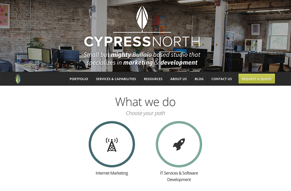
Photo Credit: Cypress North
However, these are becoming popular because one, many work very well, and two, the way we browse and consume information has changed. So, what we now see as a result, is a range of tried and tested UI design patterns: here’s a breakdown of the ones you need to know…
The hamburger menu:
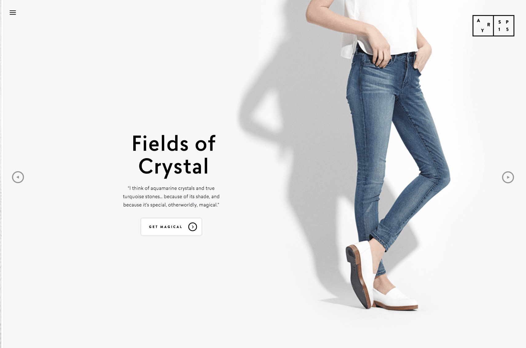
Though some avoid using this pattern due to its ‘overuse’, hamburger menus (as seen at the top left of the below example) are an easily recognisable function for users, making them an ideal choice for simple, clear user journeys.
The long scroll:
A storyteller’s dream, the long scroll is quickly increasing in popularity due to both the rise in mobile browsing behaviours and it’s effectiveness in guiding visitors through compelling journeys. Also, by breaking the scroll into clear, distinct sections, you can mimic multi-page sites to great effect.
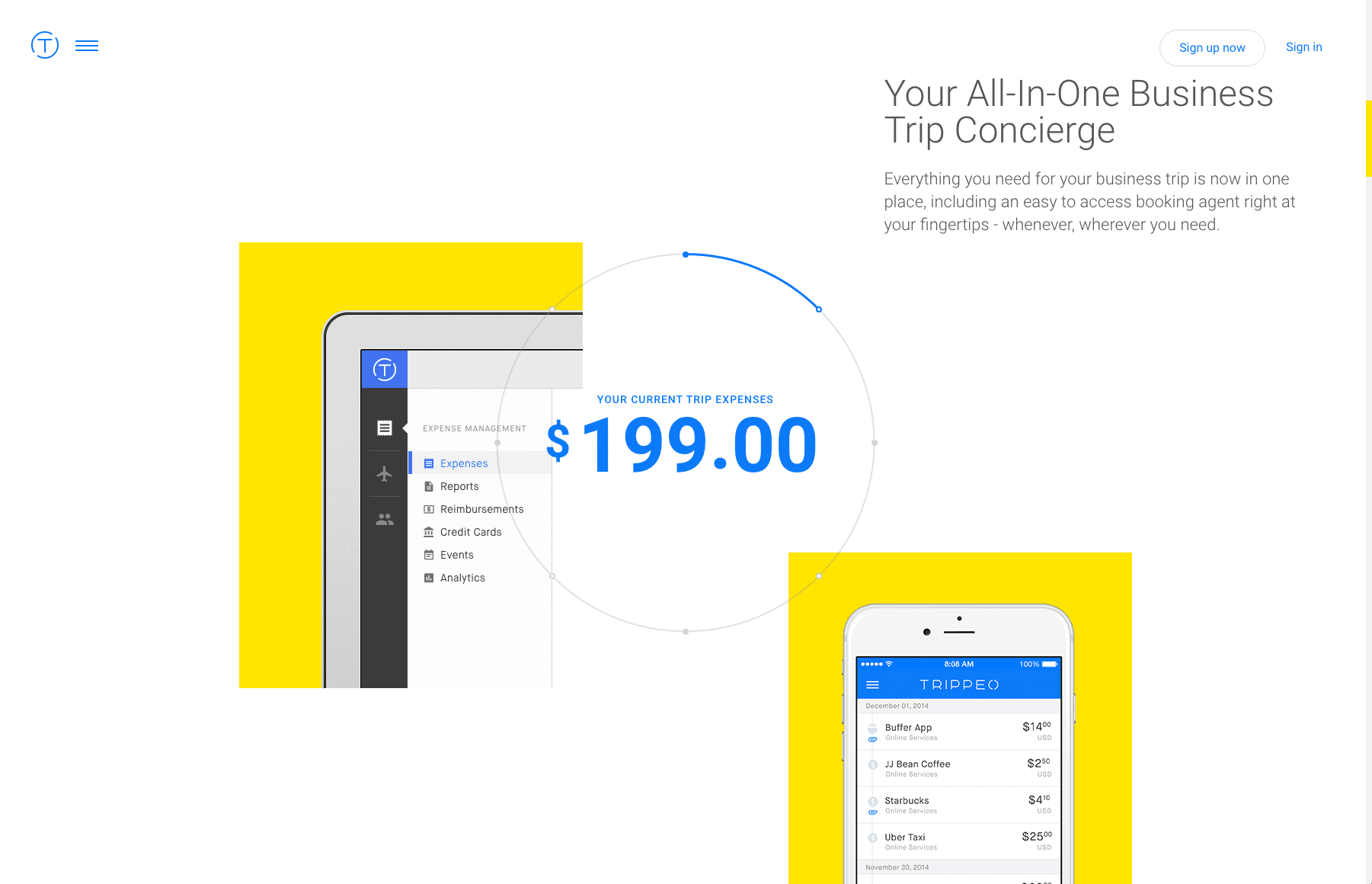
Photo Credit: Trippeo
Hero images:
Big, bold and beautiful, hero images make a statement. Furthermore, courtesy of developments in bandwidth and data compression, high-definition hero images won’t significantly impact users’ load times. For manufacturers like you, hero images above the scroll (a common layout), followed by cards or other distinct sections, allow you to quickly attract your visitor’s attention, communicate your value proposition and direct them toward relevant content on your site.
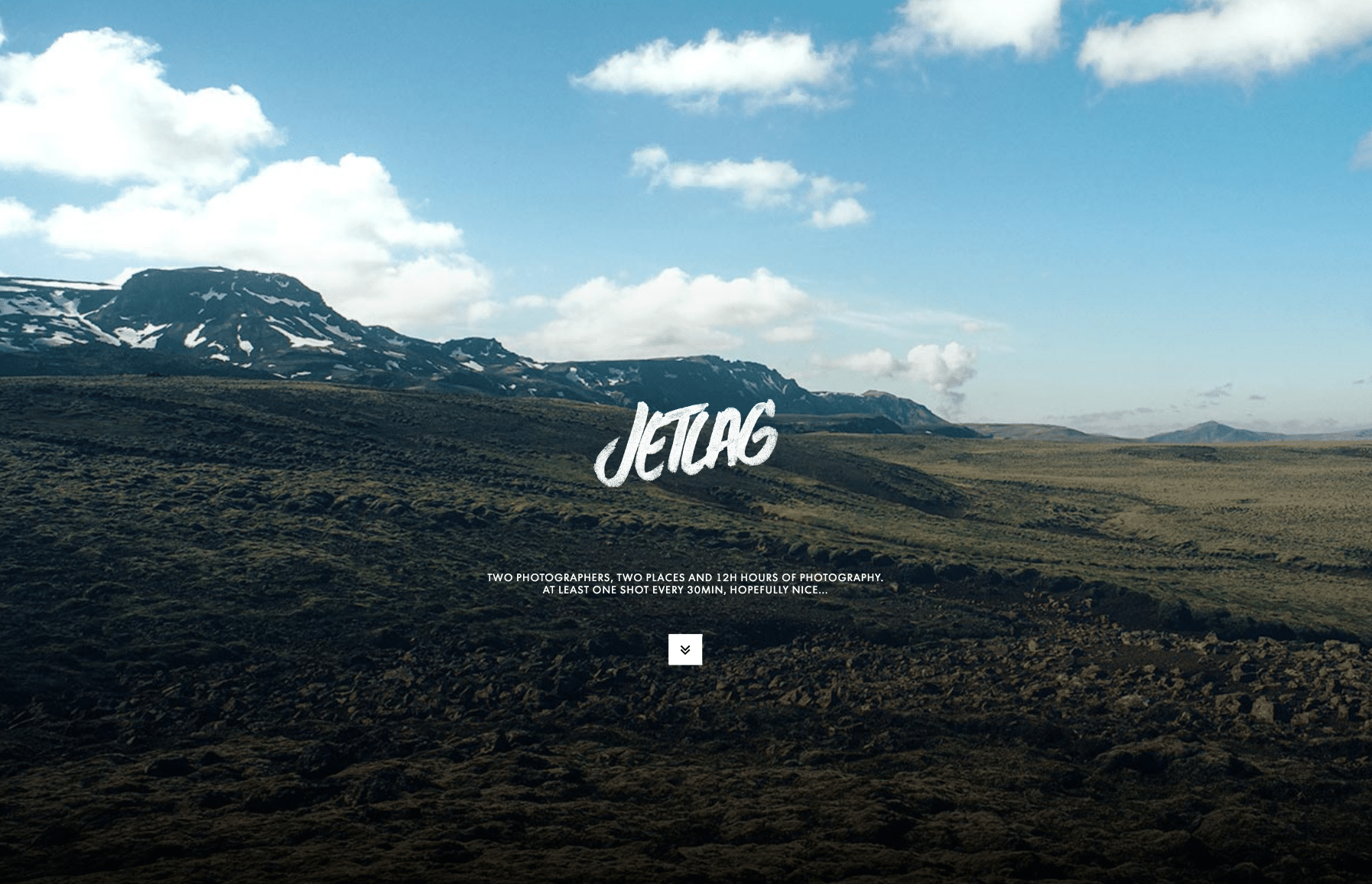
Photo Credit: Jetlag
Card layouts:
Dividing and presenting distinct ‘chunks’ of information clearly, cards are great for conveying a number of products, services and concepts on a single page without overwhelming visitors. Essentially consisting of ‘content containers’, these rectangular cards are designed to be easily rearranged for differing device breakpoints.
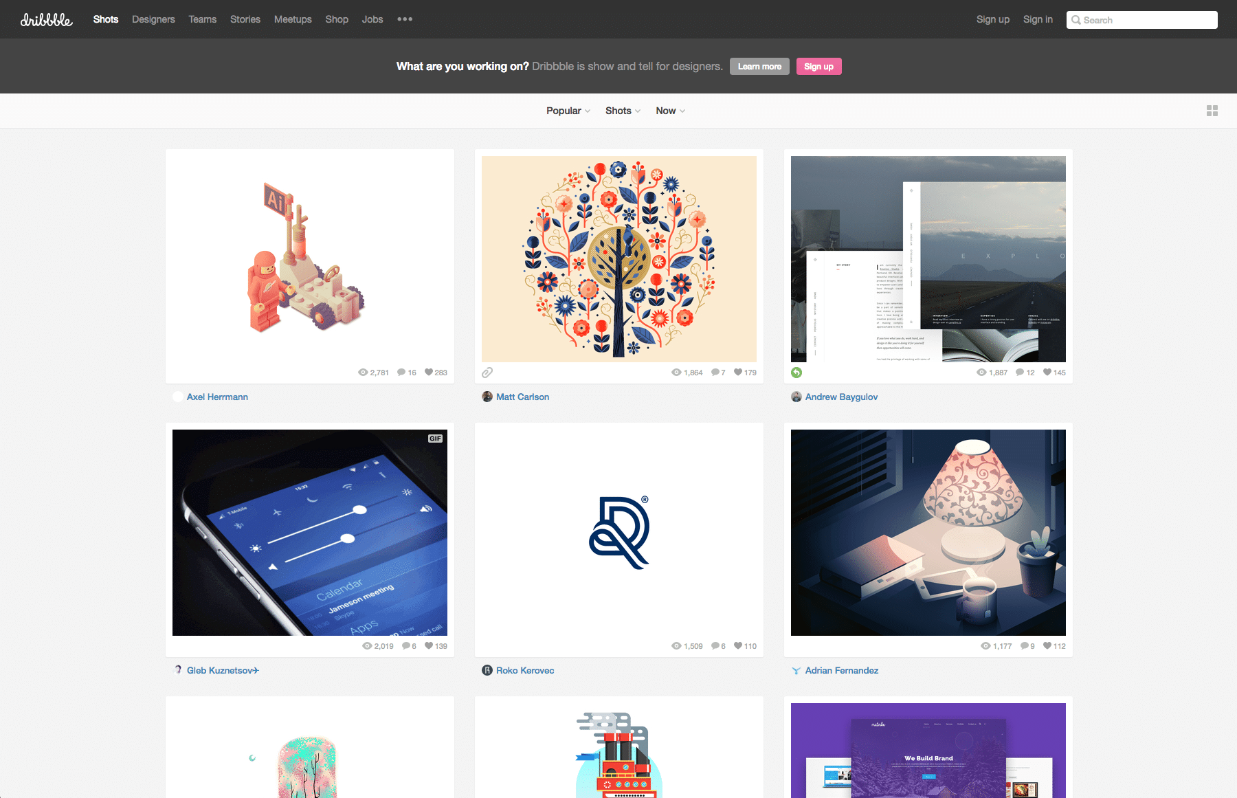
Photo Credit: Dribbble
The Rise of Rich Animations
For those looking to enhance their storytelling experience and lead visitors through narratives in an interactive and entertaining way, look no further than animations. However, as with content in general, animation should only be used when it is able to complement and work in unison with your story and brand personality. Animation for animation’s sake will do nothing but detract from the messages you’re aiming to convey.
So, with that in mind, let’s delve deeper into the world of animation. We’ll start by outlining 4 of the most commonly used:
Loading animations:
A typical choice for flat design, minimalism and one-site pages, loading animations can enhance (and even bring enjoyment to) otherwise mundane experiences such as waiting for content to load. When done right, they can add a further layer of professionalism and credibility to your site. You should, of course, use these as a complement to your brand, aligning the design with your brand’s colour palette.
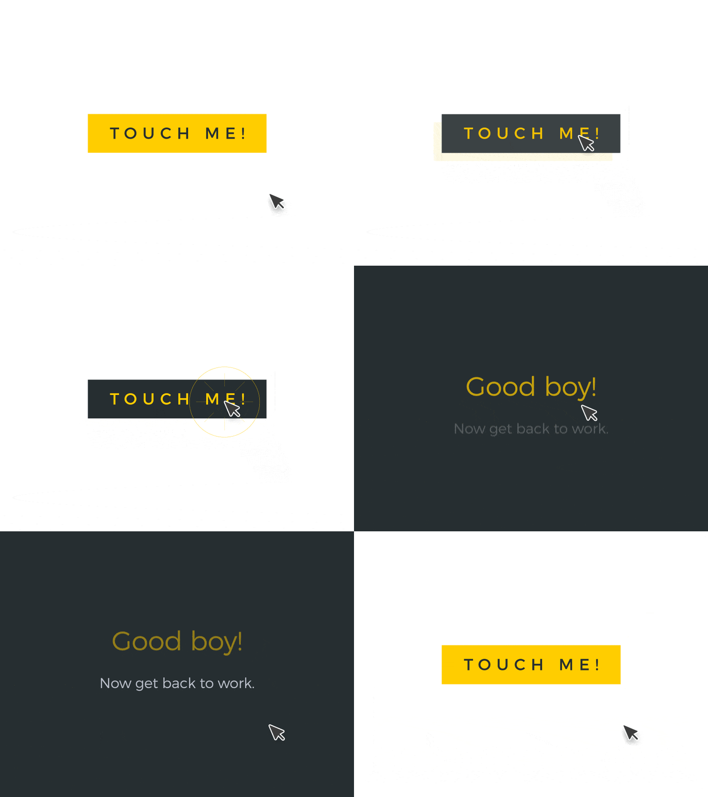
Photo Credit: Juskteez
Hover animations:
Hover animations allows users to access further content or visual feedback when they hover the mouse over a specific area. This allows sites to remain visually uncluttered yet provide users with the additional layer of information they need – it also provides an intuitive feel to what could otherwise be a boring web-experience.
Galleries:
A gallery is exactly what it says on the tin. Galleries and slideshows allow you to showcase stunning visuals without overwhelming your audience. For manufacturers looking to showcase processes, prototypes and end products, galleries can be an especially potent addition to the arsenal.
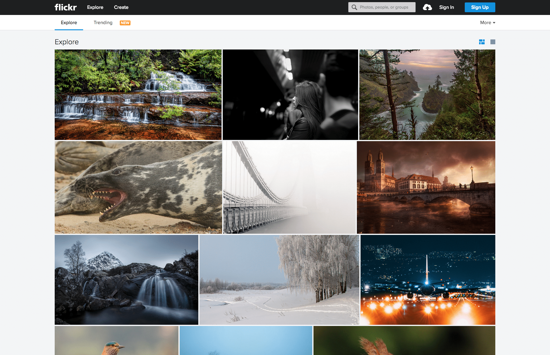
Photo Credit: Flickr
Motion Animation:
As shown in the example below, motion animation is an absolute goldmine for manufacturers. Attention grabbing and interactive, motion graphics can effectively convey the intricacies of design and manufacturing processes in ways that words or static images can’t.
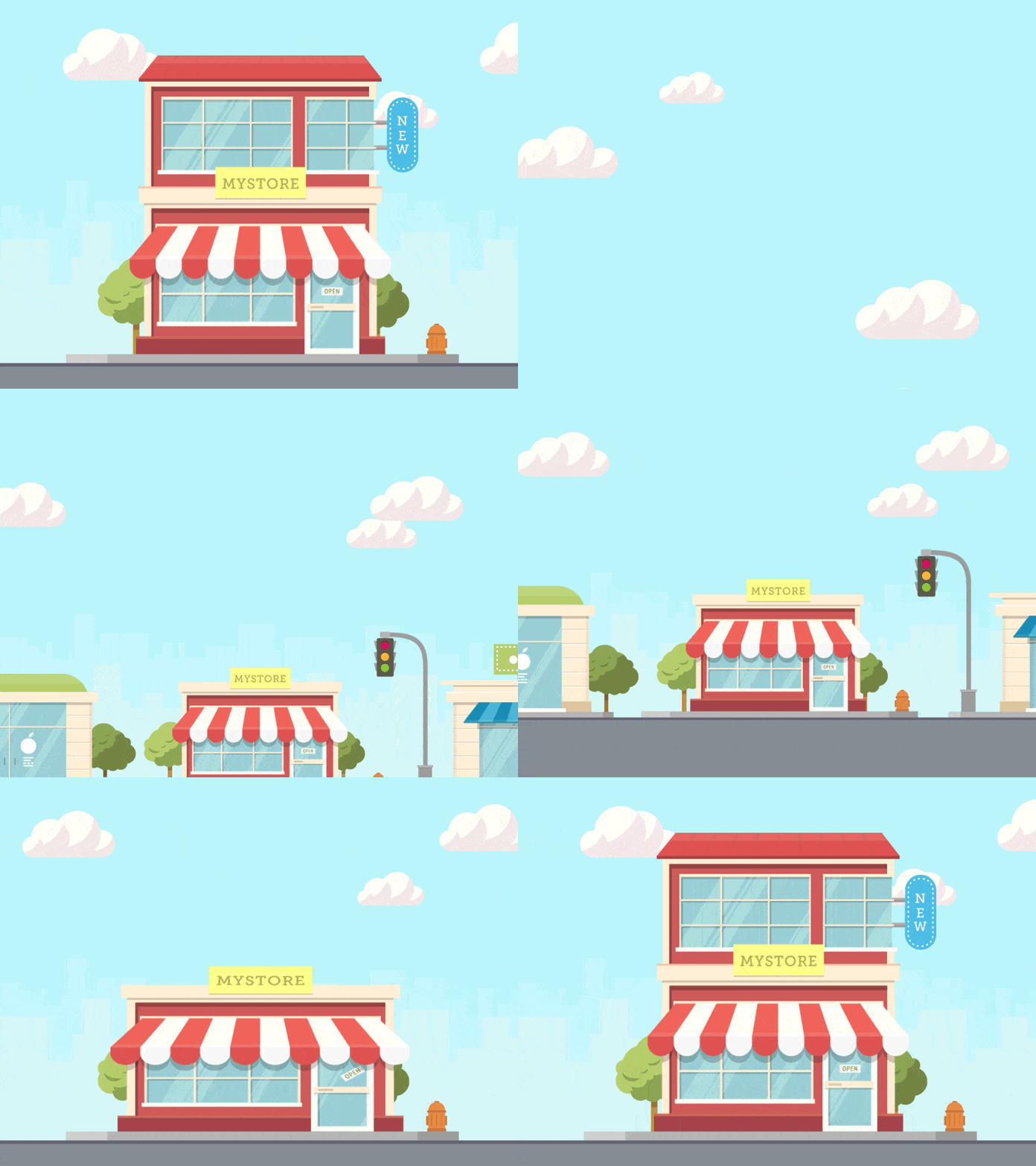 Photo Credit: Motion Authors
The Continuing Growth of Responsive Design
Unless you’ve been living under a rock, you’ll have noticed that responsive design is seeing an exponential growth in popularity. And this isn’t surprising, given the world’s changing mobile browsing habits: as always, design is simply reacting to demand and the behaviour of users. What this has led to is responsive design moving away from being a mere trend, and more of an actual design staple for the modern website.
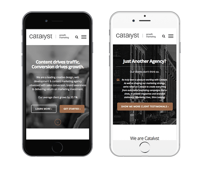
Photo Credit: Catalyst
While responsive design is a cost-effective and simple way for businesses to ensure full mobile functionality, you need to ensure designs are carried out in accordance with certain best practices. If you don’t, you might find your performance compromised. To prevent this, we suggest having a look these top tips.
Speaking of performance, you’ll also need to ensure your responsive website is fast, very fast. This is vital to a stand-out user experience (UX), removing the barriers to your visitors finding the information they’re searching for. To help you get around any speed issues and offer an enhanced UX, take a look at the tips outlined here.
The Right Design for the Industry
Although trends are simply a reflection of what is popular at the time, following them blindly is never the right approach. See, the manufacturing industry is unique and what works for a luxury B2C retailer, may not work for you. As a result, you need to conduct some research into the browsing habits and online behaviour of your target audience, using this as the basis for your web design. By all means, keep an eye on the ever evolving website trends, but keep a closer eye on your competitors, your customers and where your site is performing well.
After all, trends come and go. Insight-driven design remains forever powerful.
To help you begin reaping the benefits of insight-driven design, we’ve created an in-depth present state report that highlights everything you need to know to stand out in a stagnant manufacturing market.
If you’d like to access a deeper look into the threats and opportunities you’ll face, and how to make the most of them, simply download the guide by clicking the button below.
{{cta(‘880237f4-989f-4b6d-9f3f-bb58b1685529’)}}

